Brand repositioning & Packaging design
Katia is a local makeup brand seeking to differentiate itself within a saturated beauty market and build a strong community. The founder decided to initiate a full rebrand of Katia’s identity and product packaging.
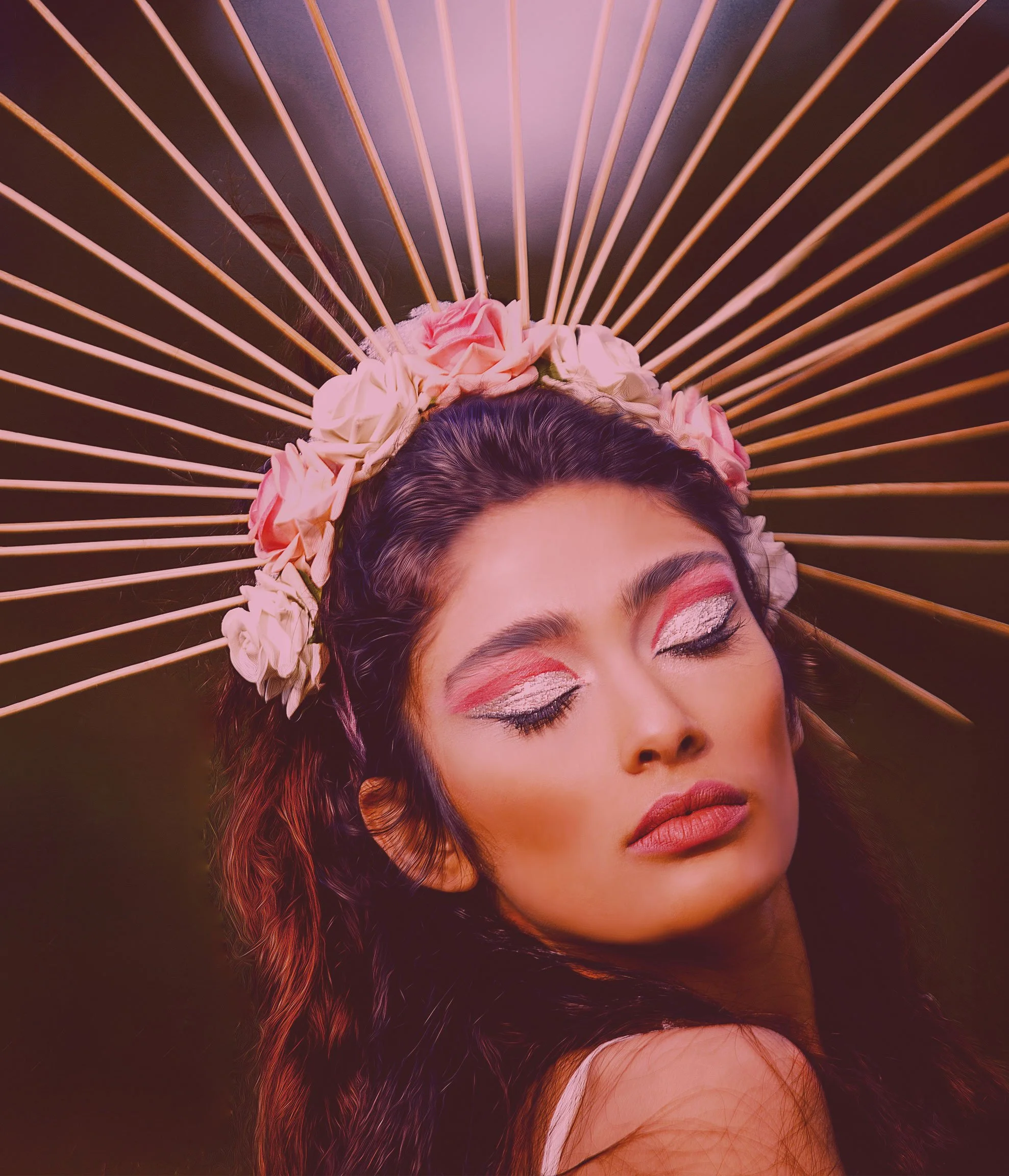
I led the visual direction for this project, reimagining it through a system inspired by astrology and symbolic narratives. The objective was to elevate the brand’s voice and create a more distinctive personality that resonates with its target audience.
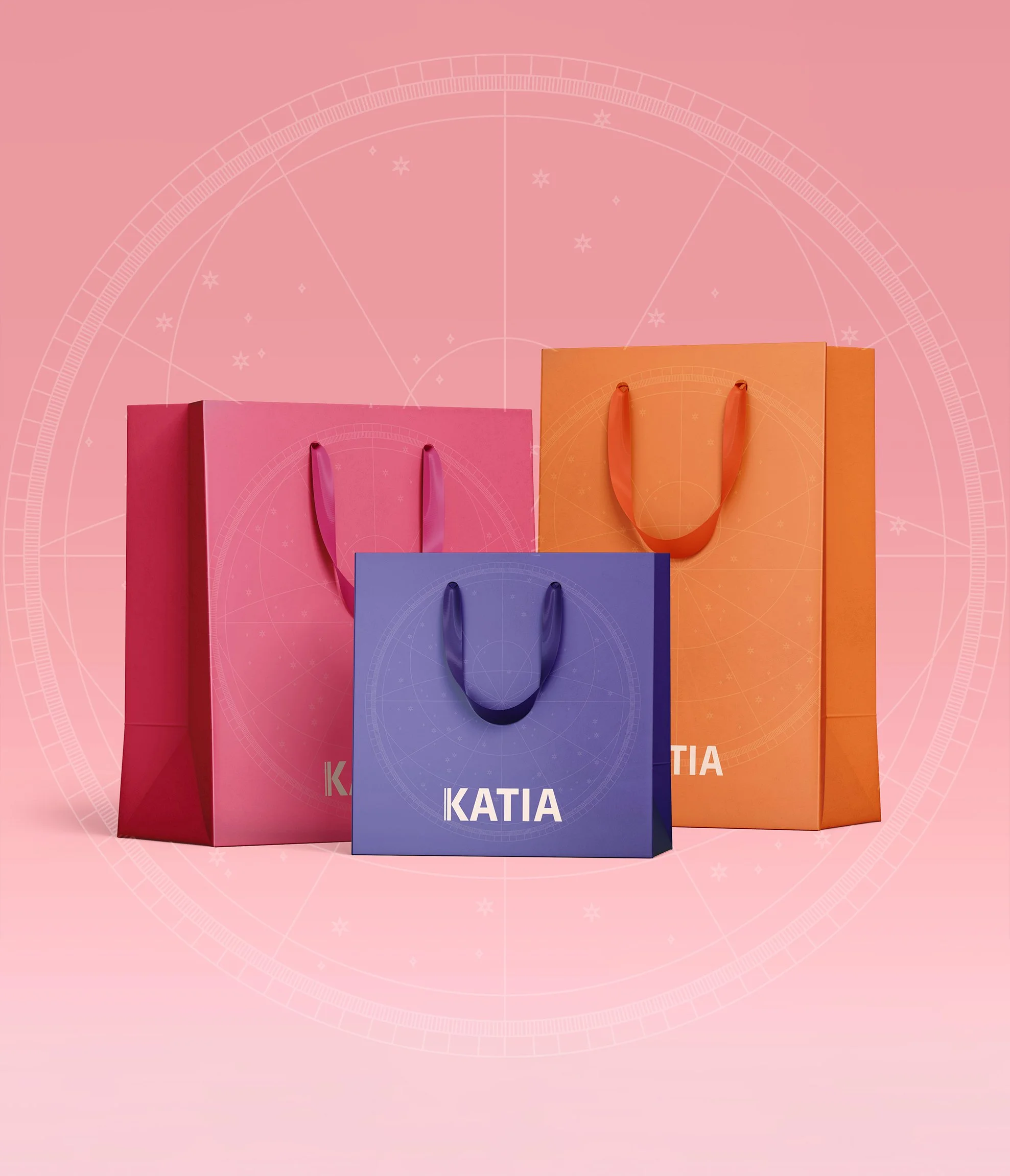
This direction was then applied across packaging, social media, and in-store booths, creating a more expressive and recognizable brand.
Project Roles: Art Direction, Visual Identity, Packaging Design, Illustration
Client: Katia
Agency: Zaini Studios
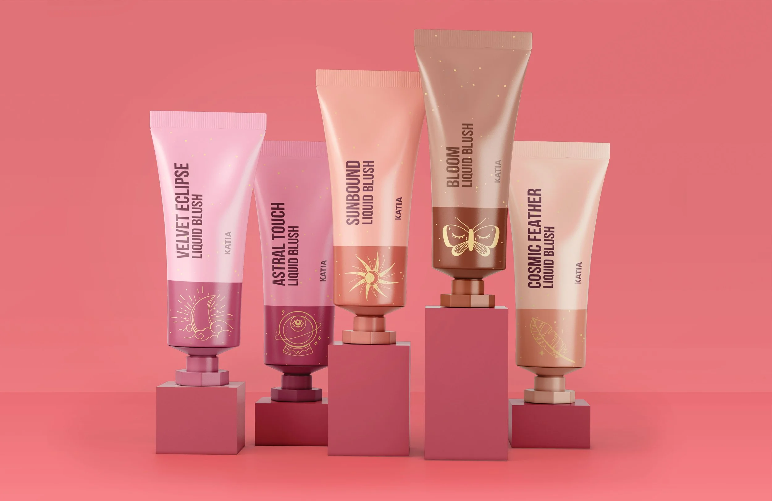
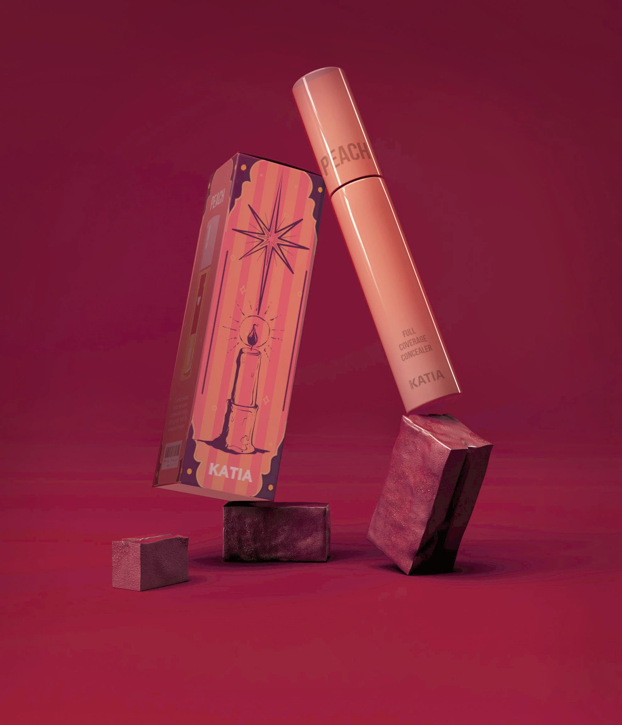
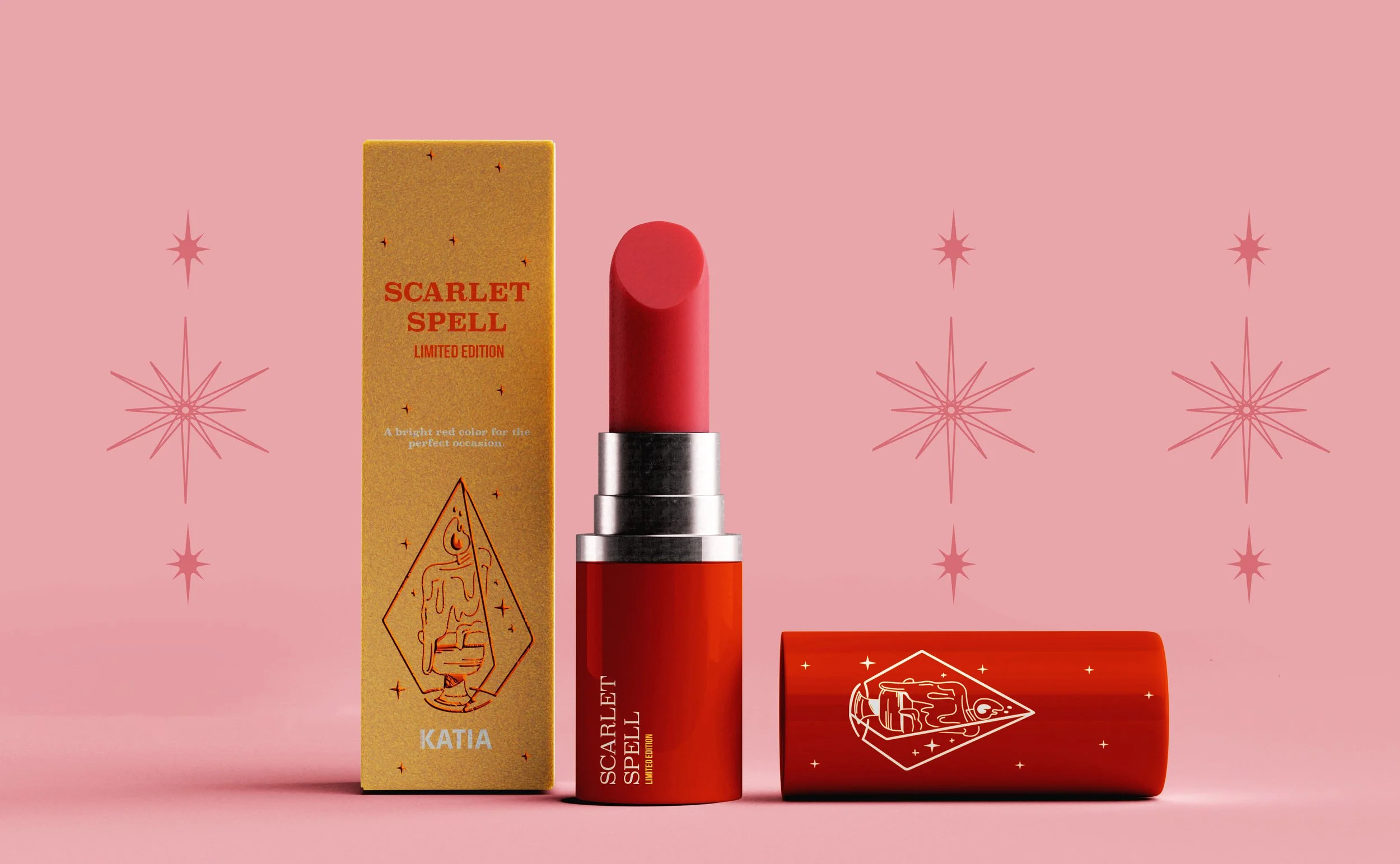

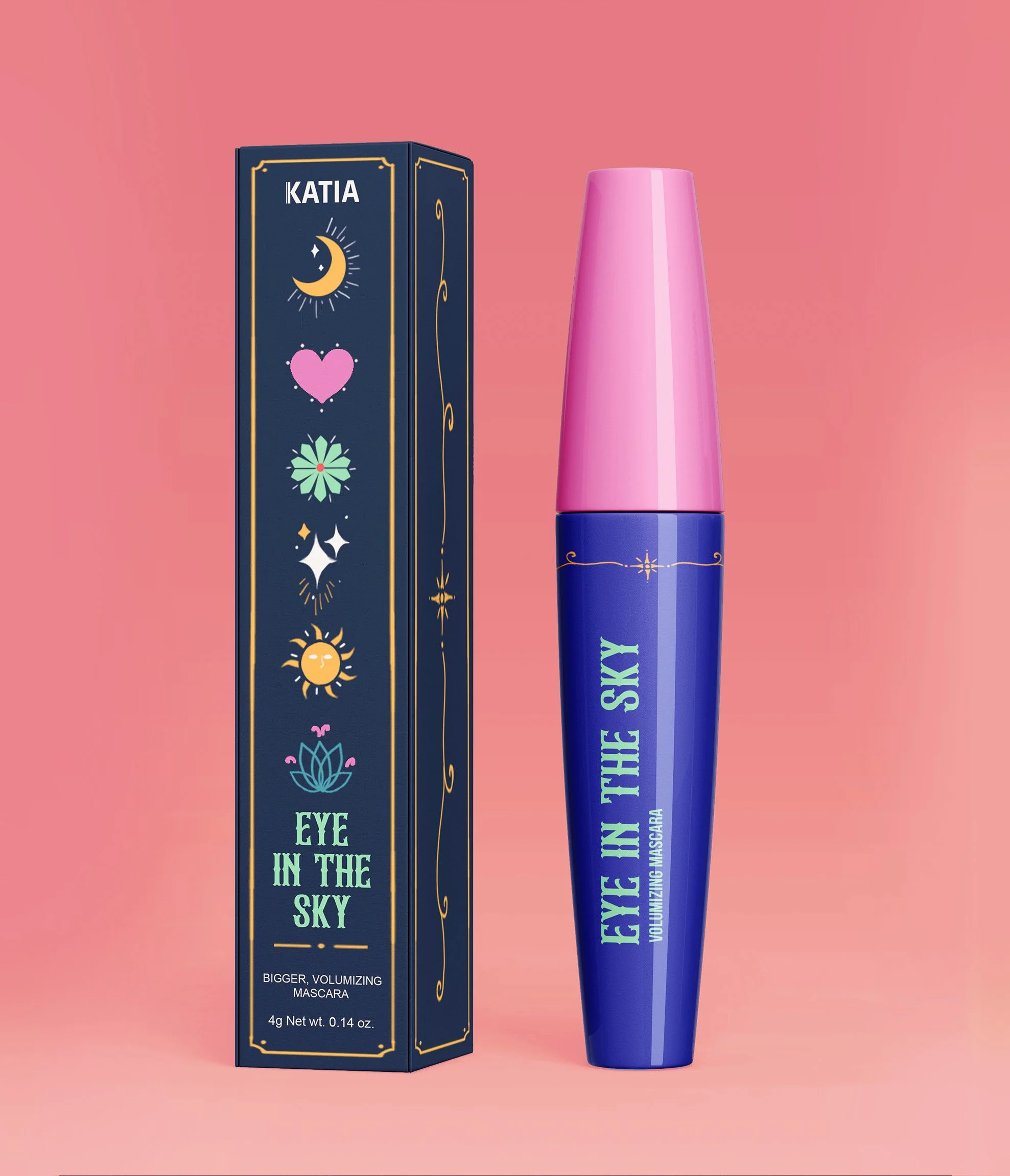
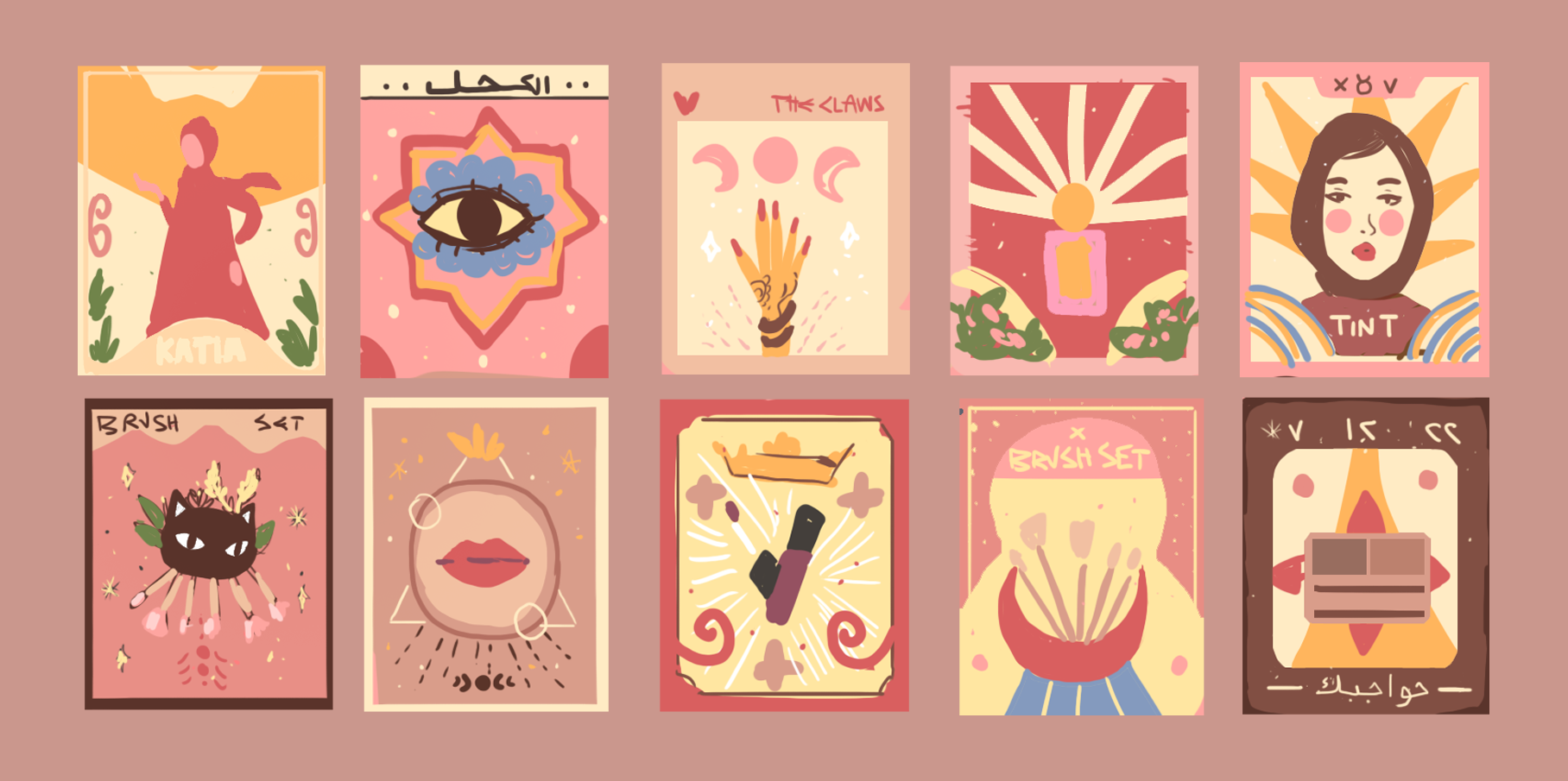
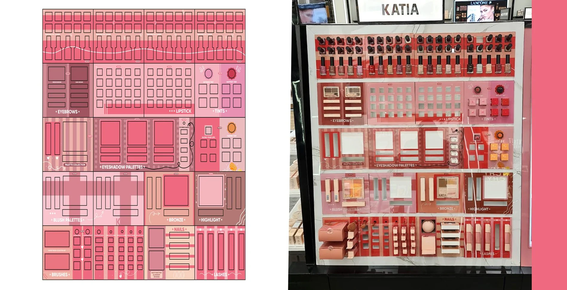
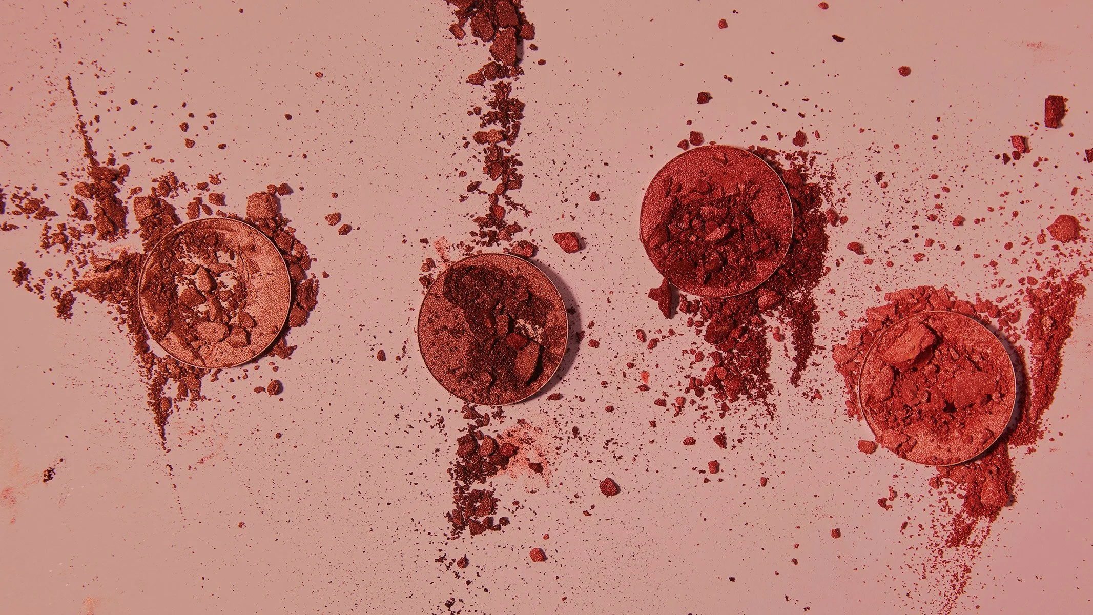
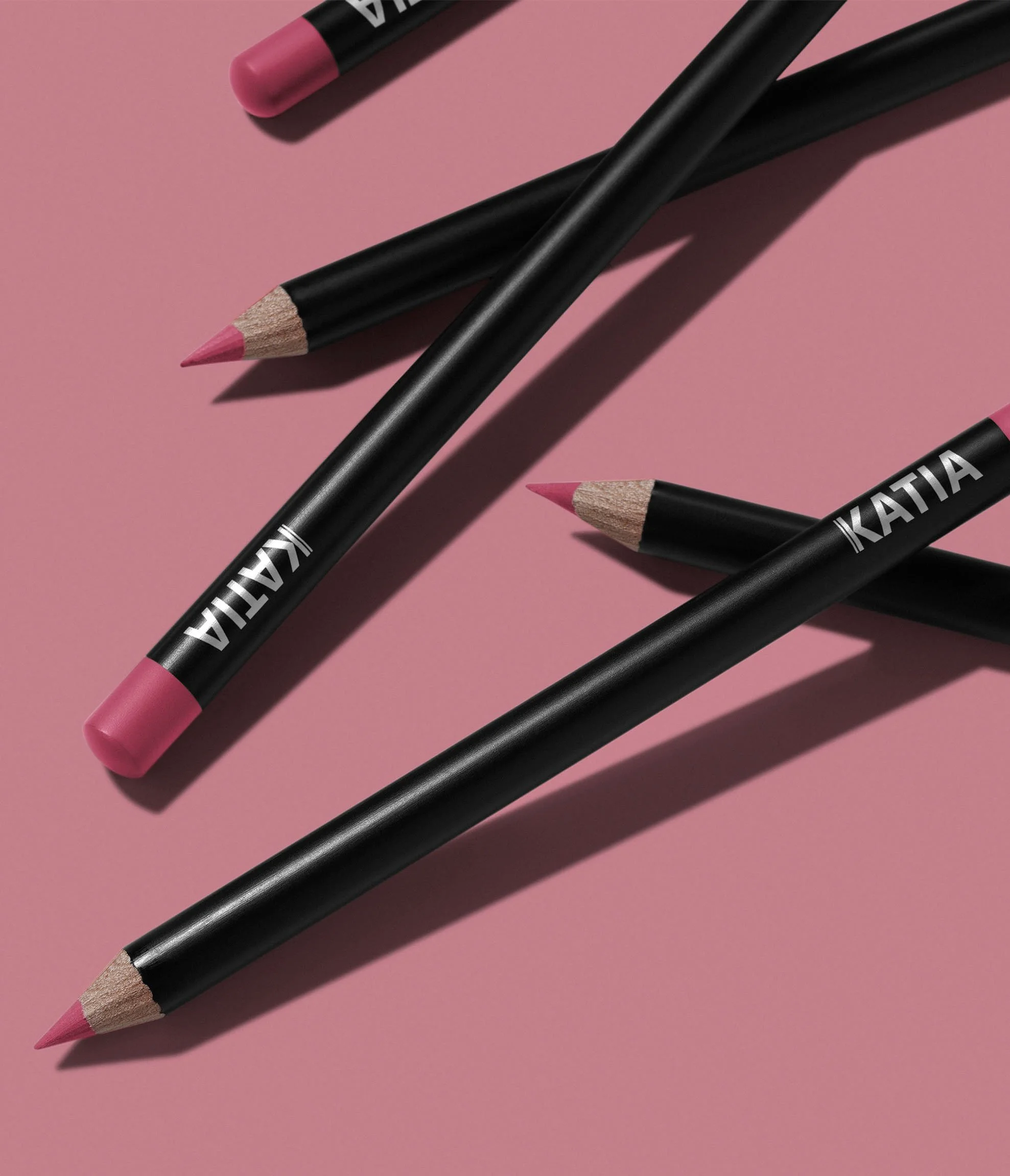
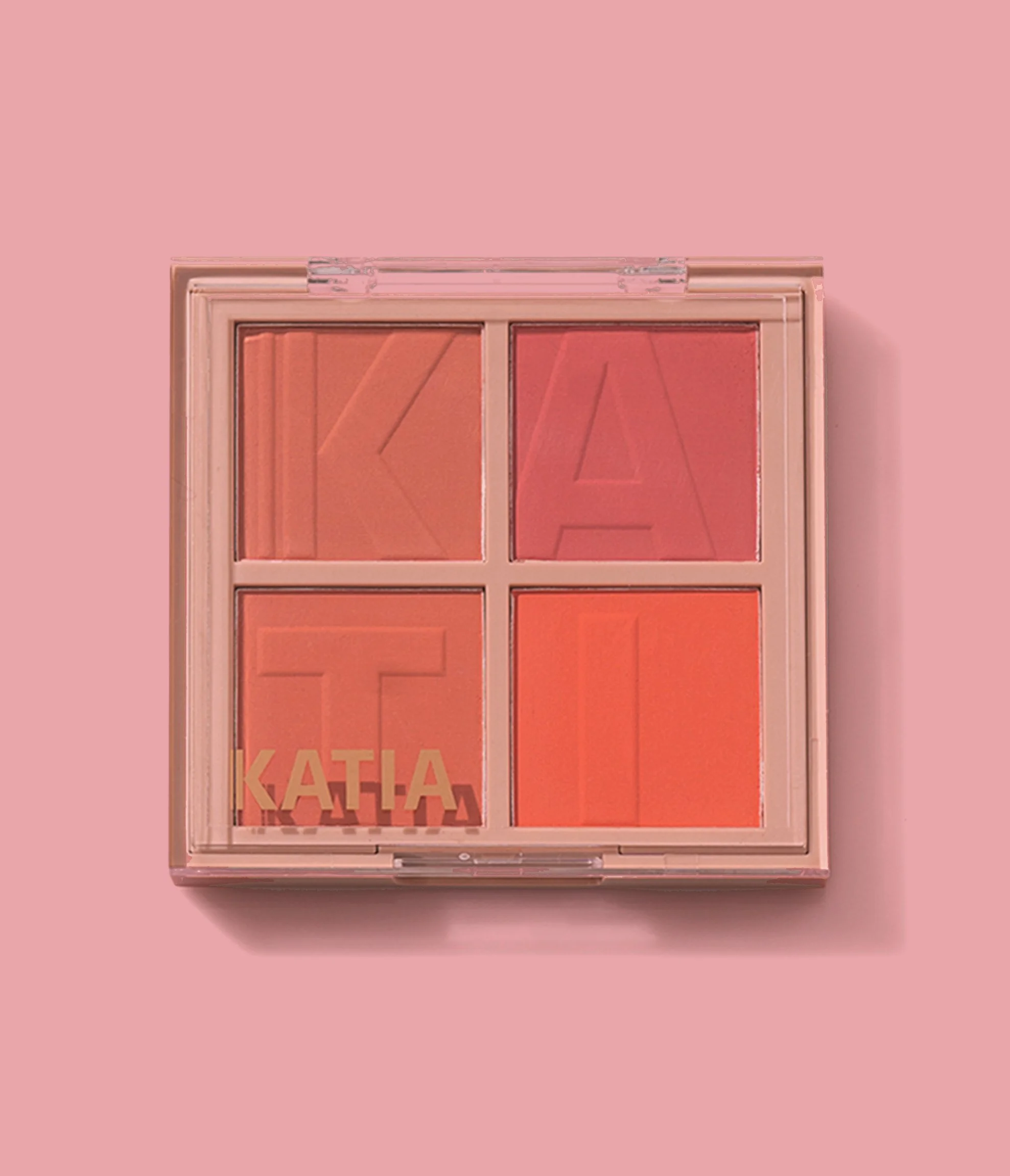
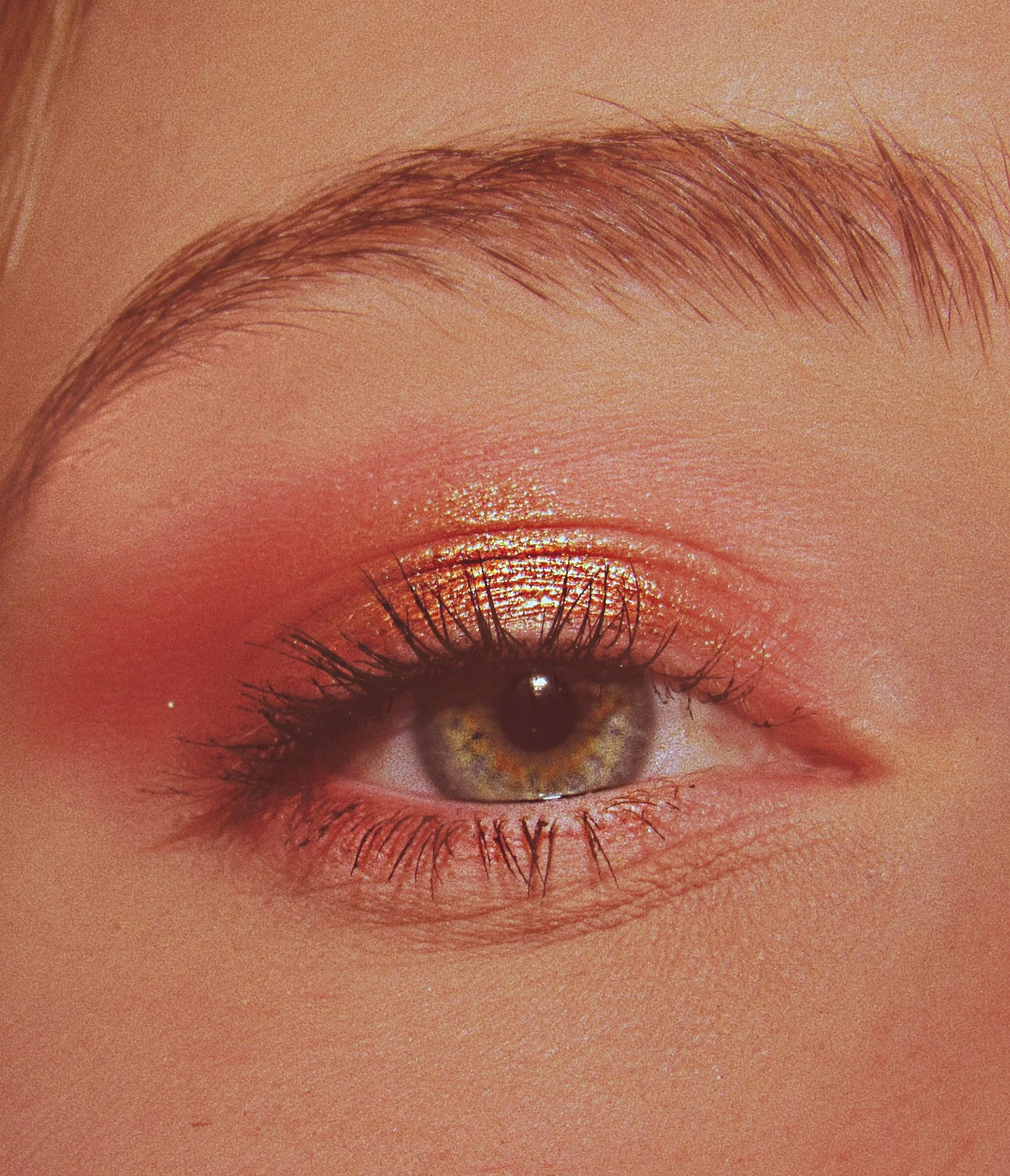
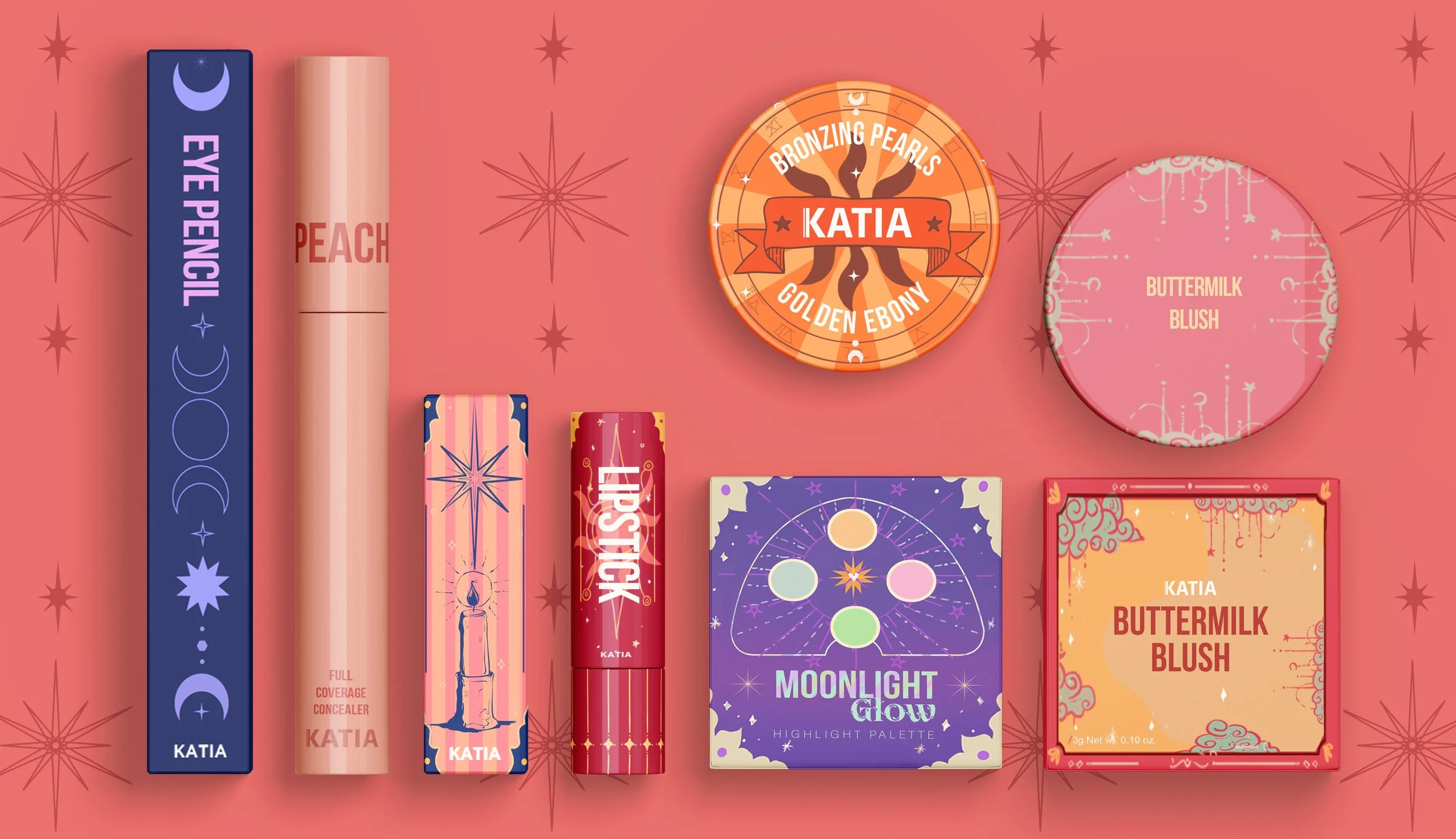
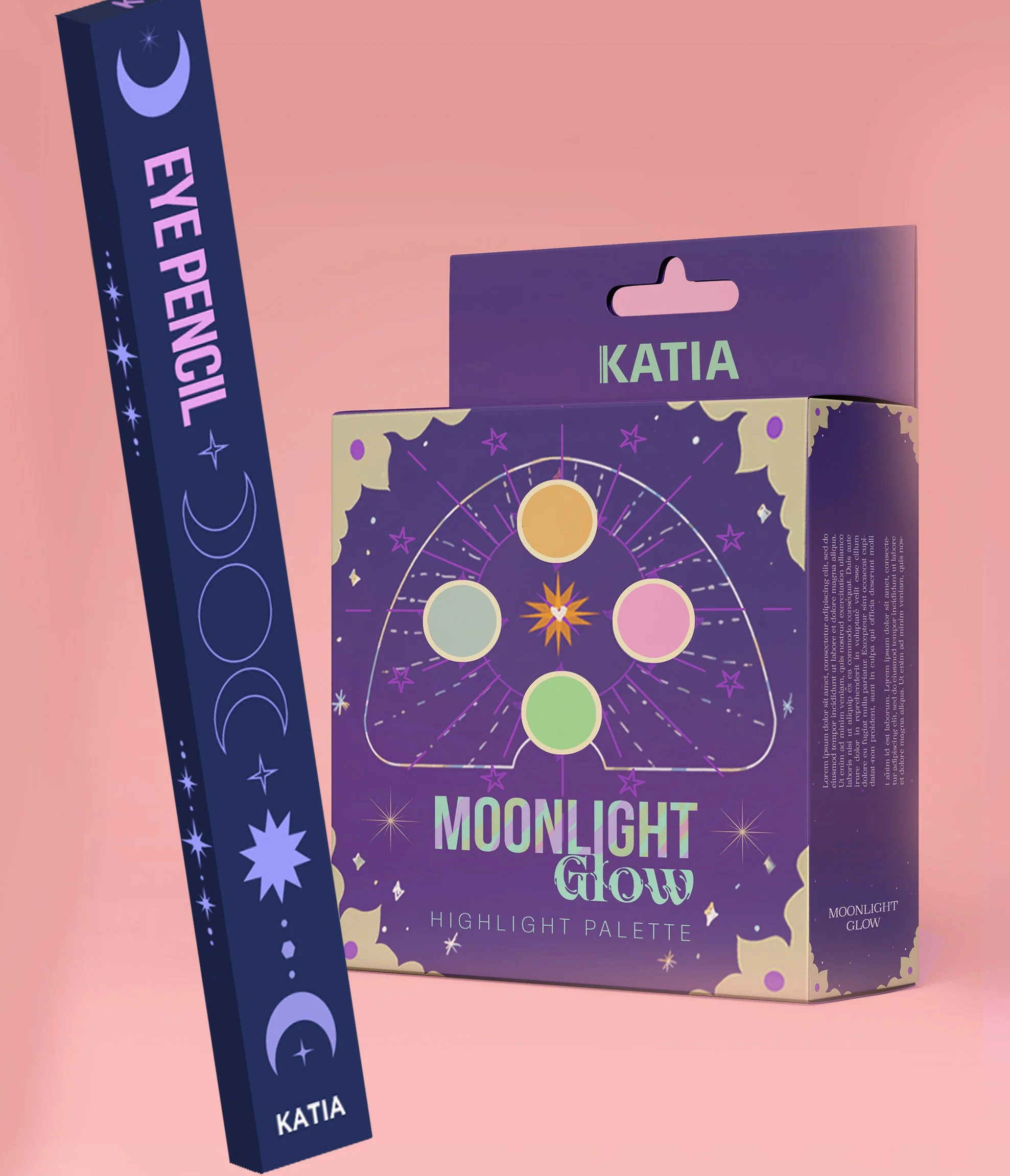
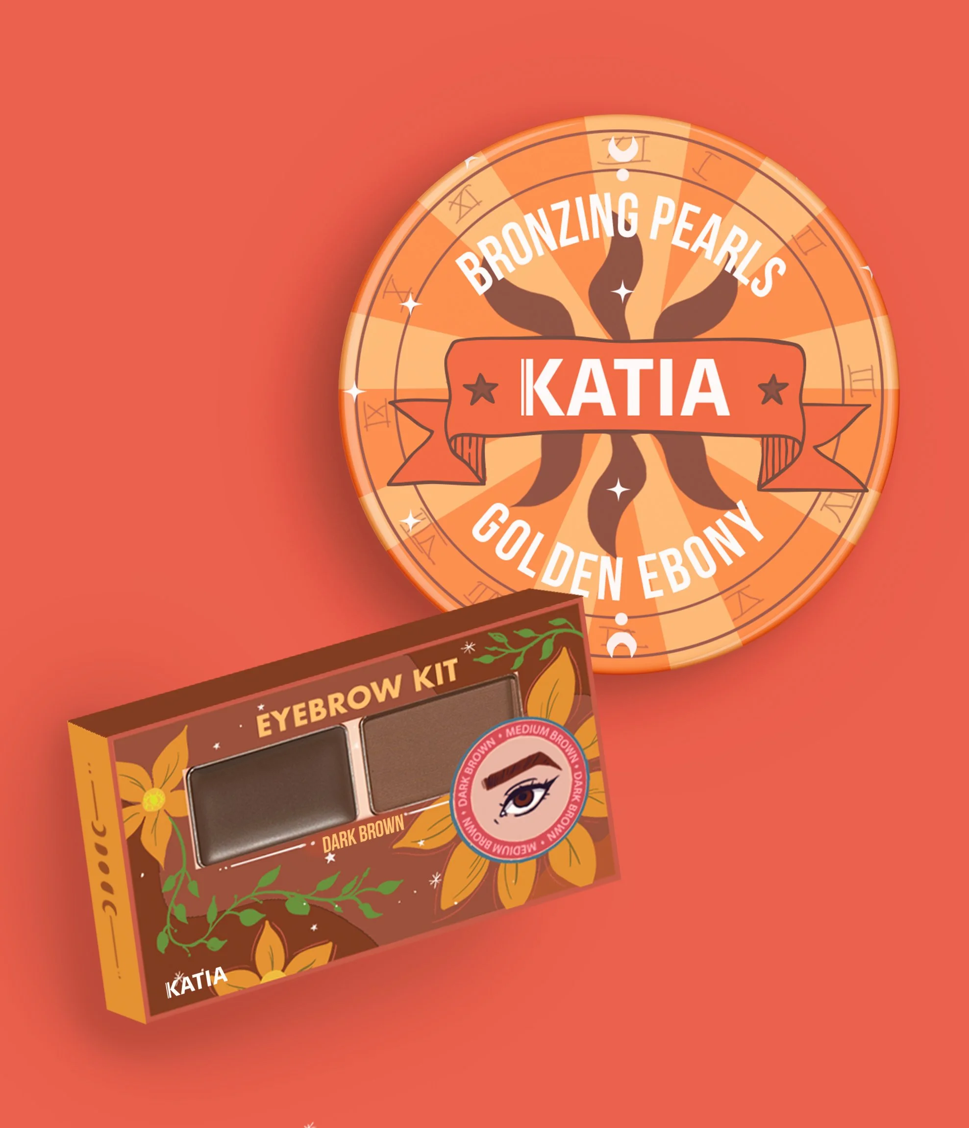
PACKAGE DESIGN
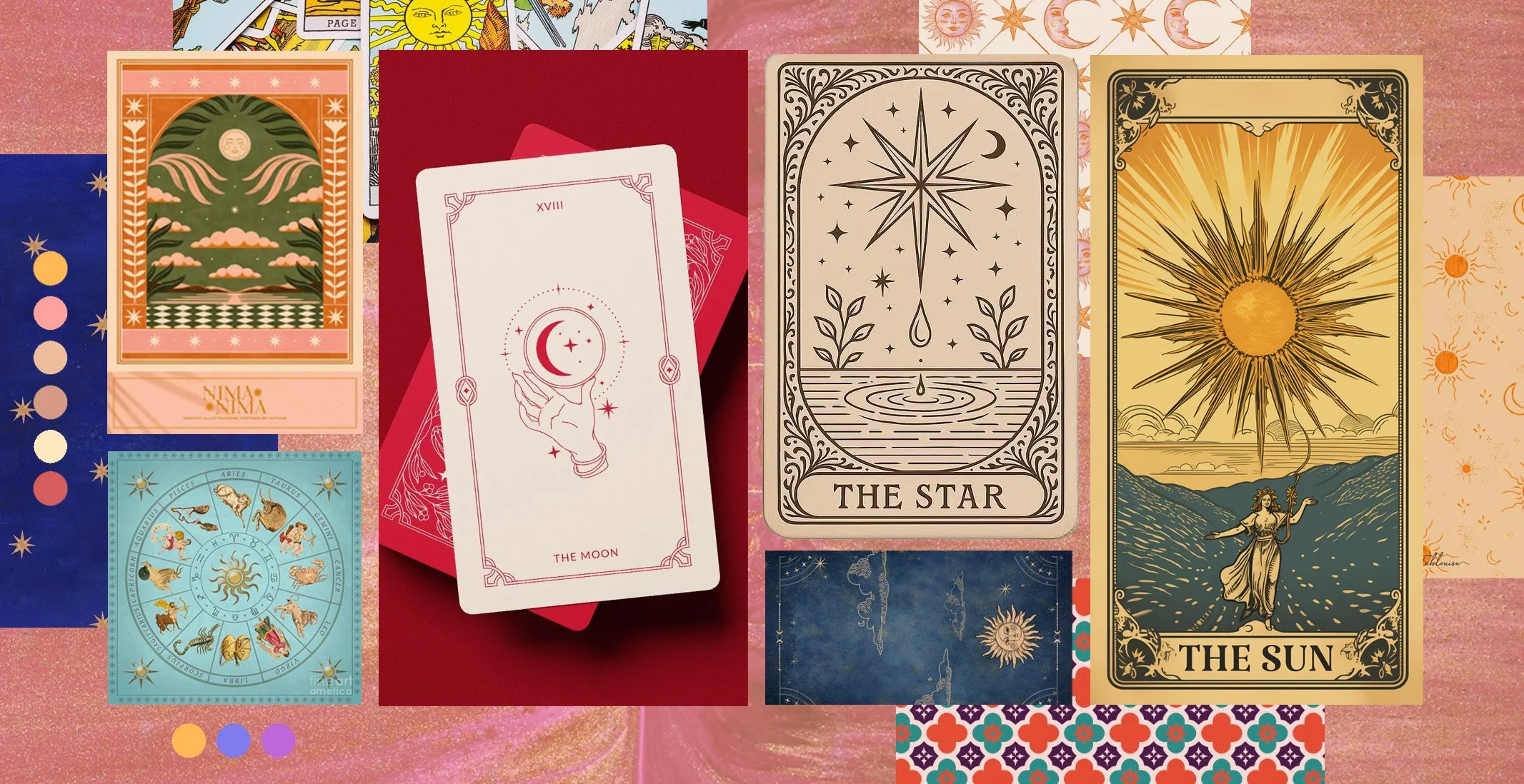
Astrology has long been a part of Arabian cultural history, which is what inspired the direction of this project. Drawing from the book “Astrology” by Taschen, I studied these elements and adapted them into more local looking designs.
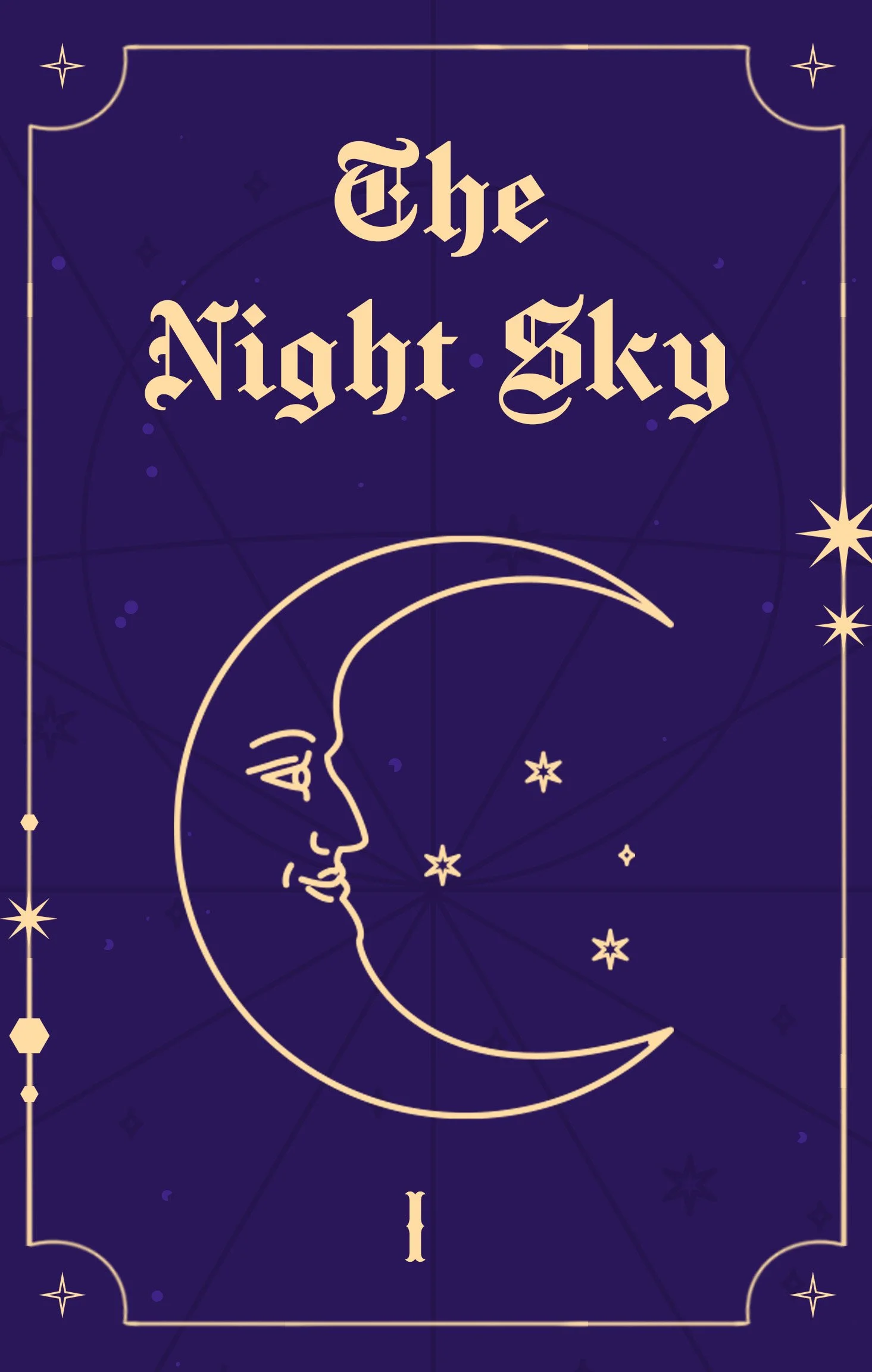
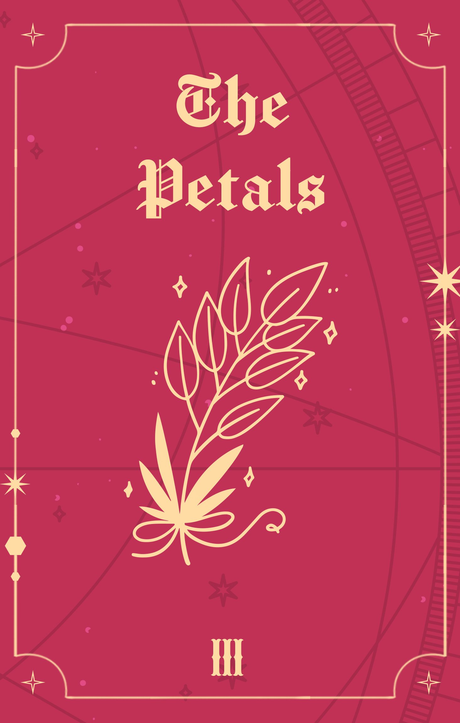
To keep a unified look, I grouped the products under 3 main themes: The Night Sky, The Light, and The Petals; giving each product a distinct character and mood.


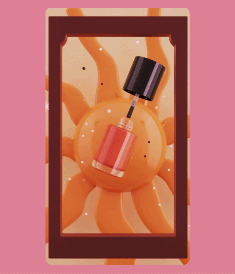
DIGITAL & PRINT APPLICATIONS
Illustration played an important role in helping me find the right symbols to use and explore how to integrate that astronomical look with the local culture. Our super talented 3D designer then took the sketches I made and turned them into animated videos for social media.
A full line of make-up with a new identity was the end result of this artistic endeavor.